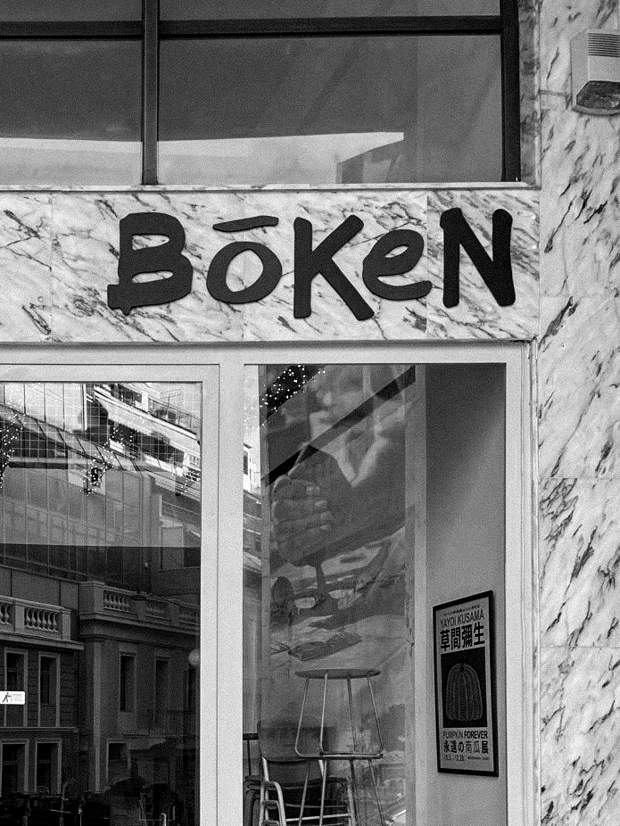
Bōken is a fusion of cultures and ideas, designed for the modern nomad. Located in the heart of Athens, it draws on Japanese minimalism and Danish design while honouring Athenian heritage.
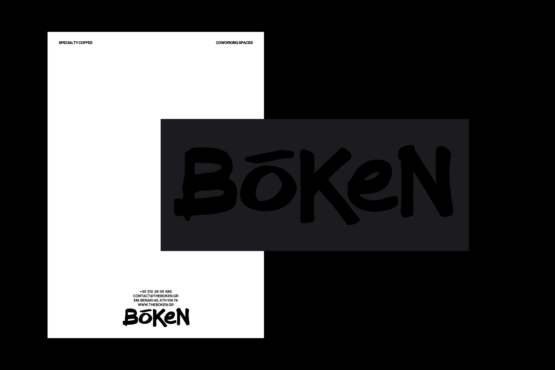
This dynamic creative studio at Emmanouil Benaki 40 in Exarchia serves as a meeting point for global and local creatives, blending disciplines, perspectives, and practices.
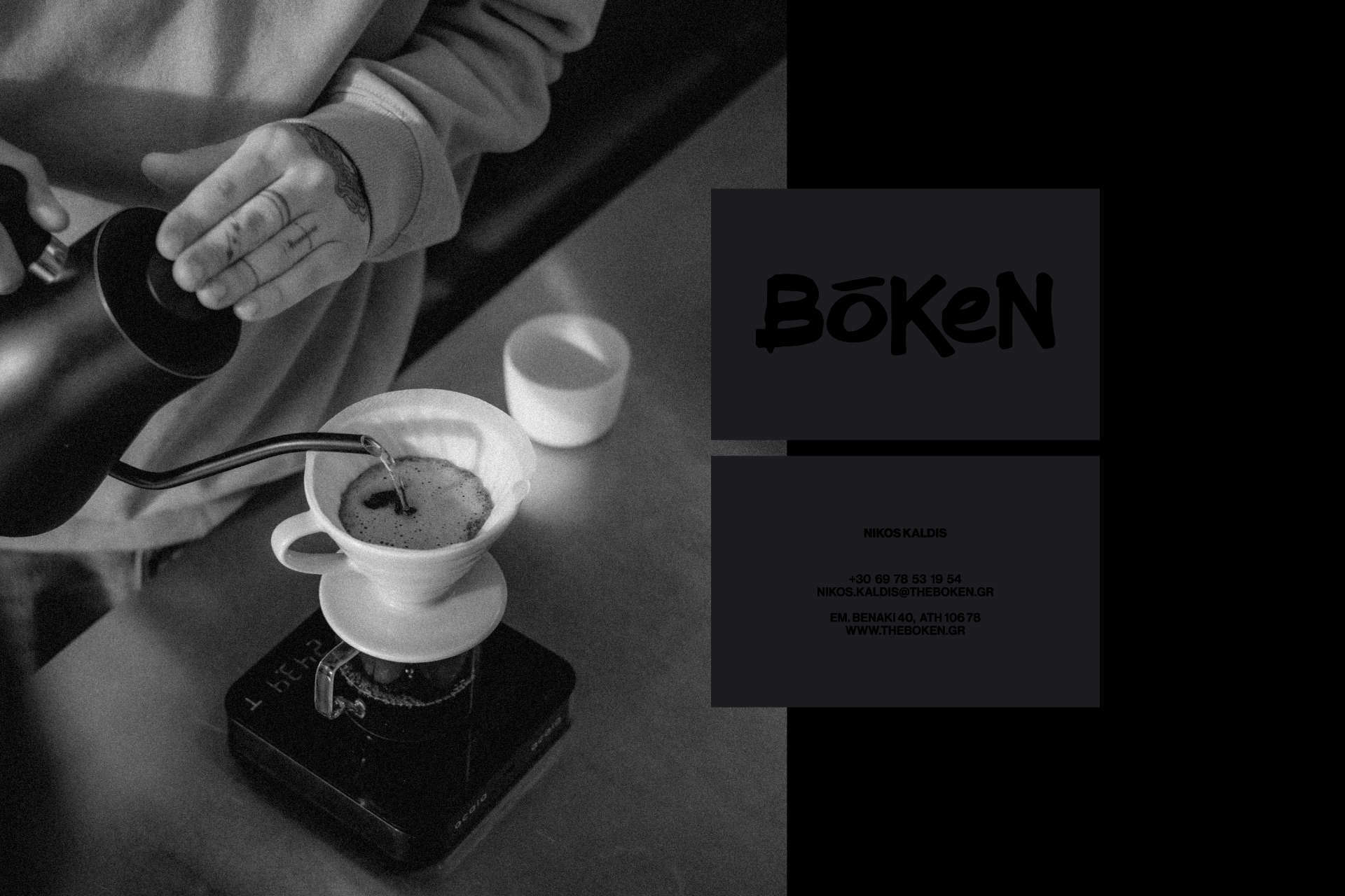
Designed for adaptability, the space fosters collaboration through multipurpose layouts that evolve with its community’s needs. It integrates a specialty coffee shop on the ground floor, co-working spaces on the first floor, and a content creation studio on the second floor—creating an ecosystem where ideas take shape.
The visual identity reflects this convergence. A structured, modernist foundation rooted in Scandinavian design is layered with expressive elements inspired by Japanese calligraphy and graffiti. This duality—precision and spontaneity—mirrors Bōken’s ethos: a space where structure and experimentation coexist, fostering an organic sense of community.
A key part of the project was the naming process. "Bōken" (冒険) means "adventure" in Japanese, capturing the spirit of exploration and creative discovery that defines the space. The name also subtly evokes the word "book," drawing a connection to Exarchia’s history of artisanal bookbinding—a legacy still visible in the mural of Guido van Helten across the street. The design elements act as a connective thread, shaping an environment that encourages exchange, expression, and the continuous evolution of creative dialogue.
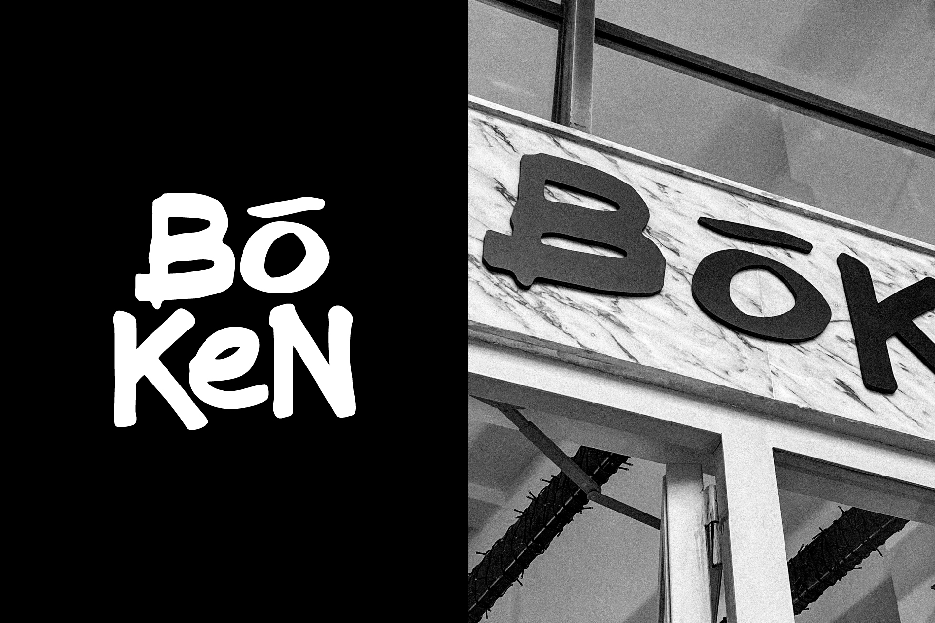
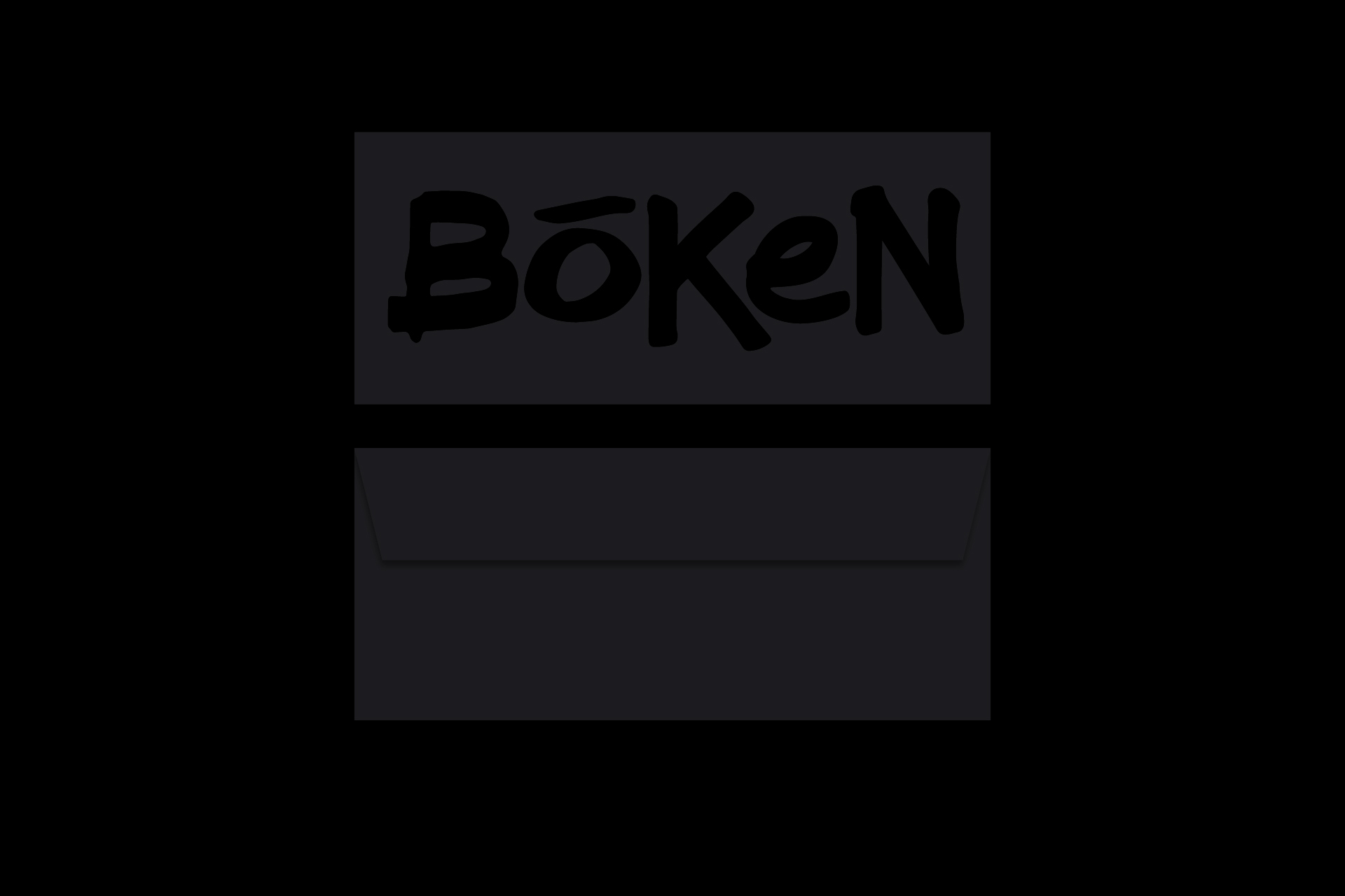
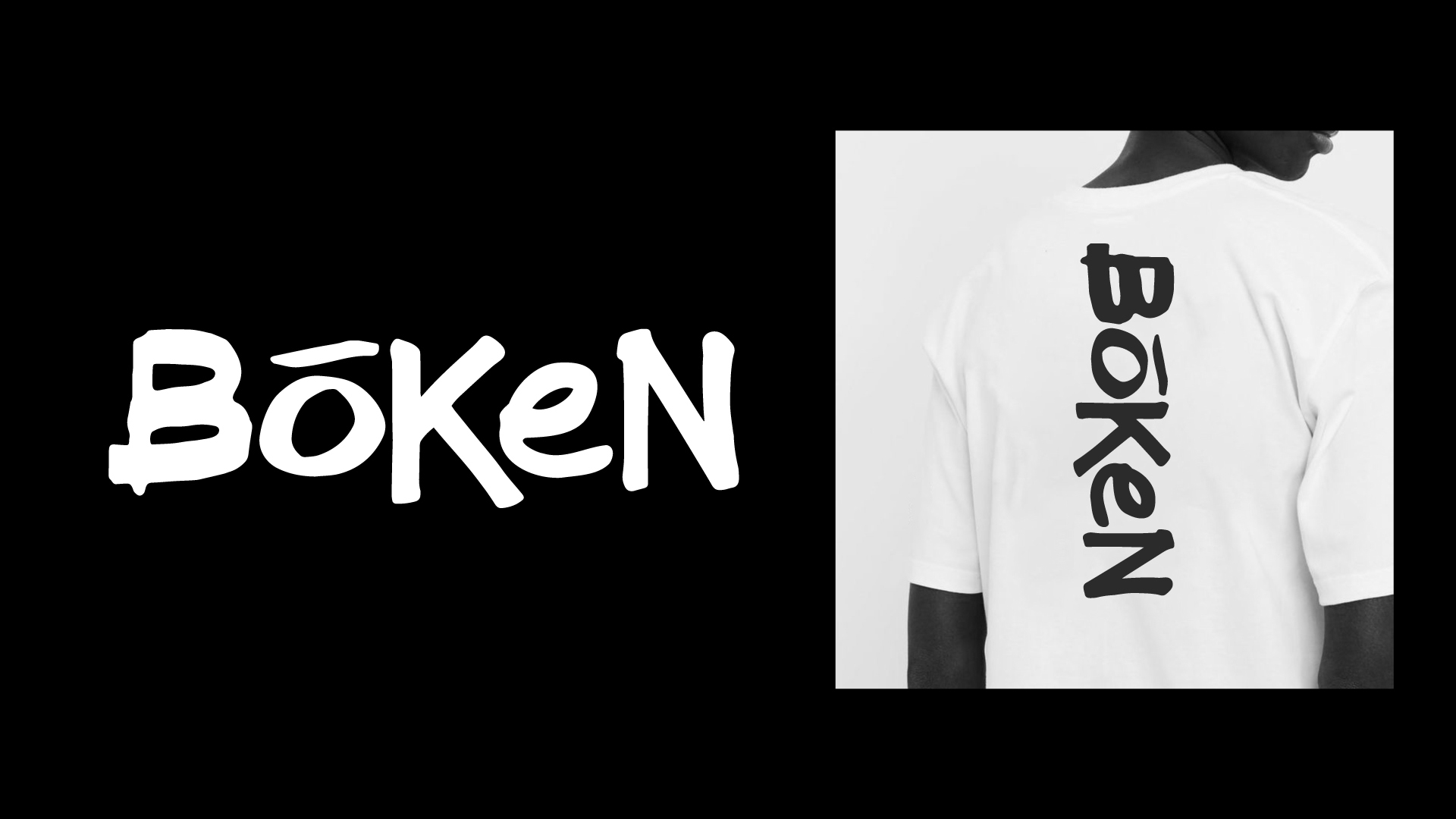
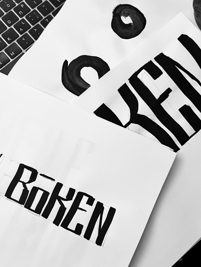
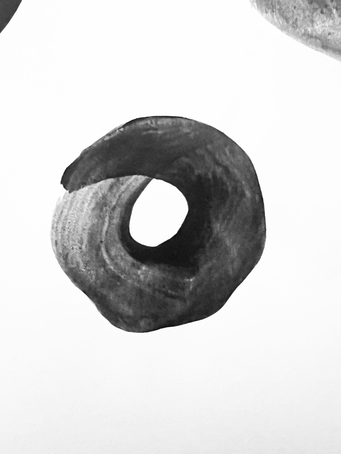
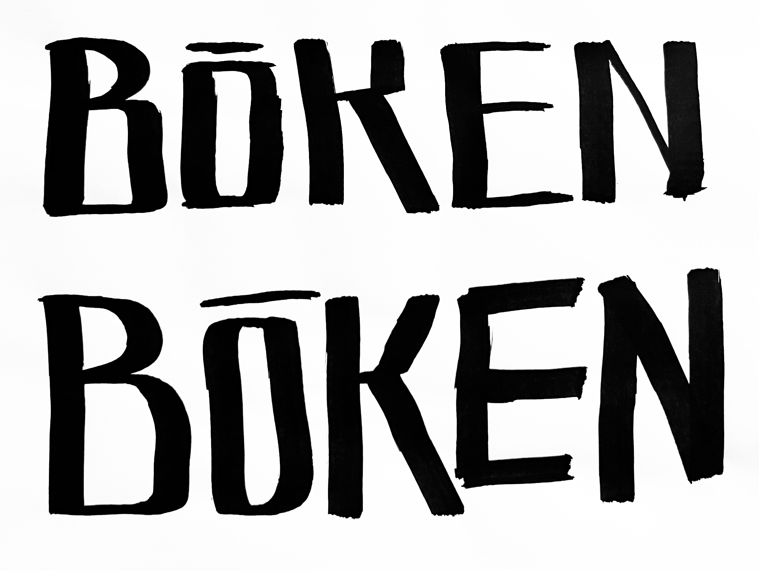
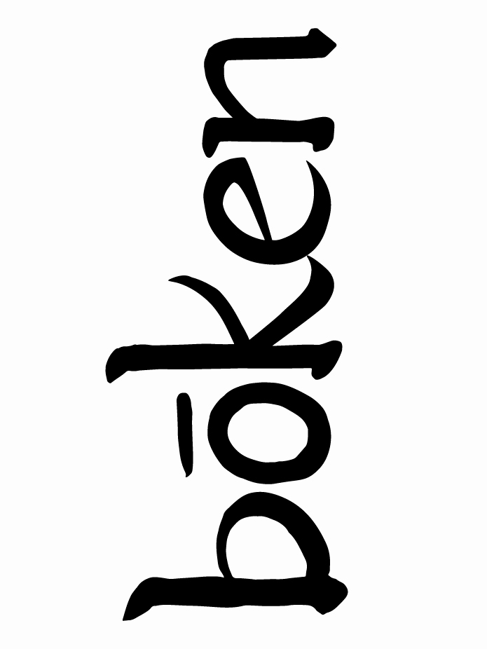
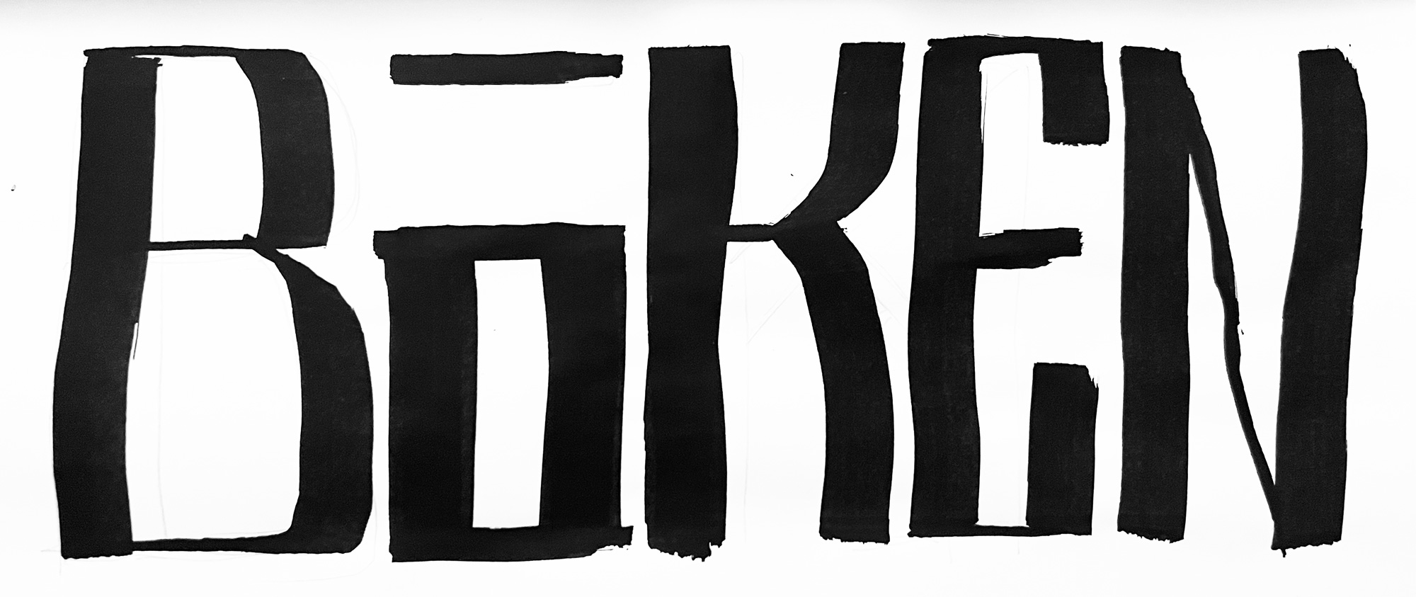
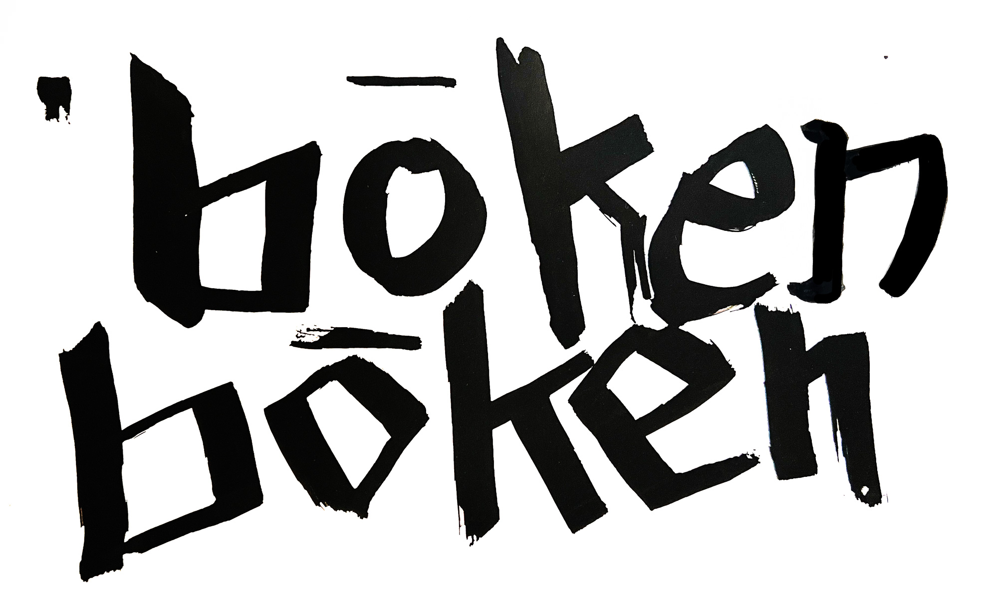
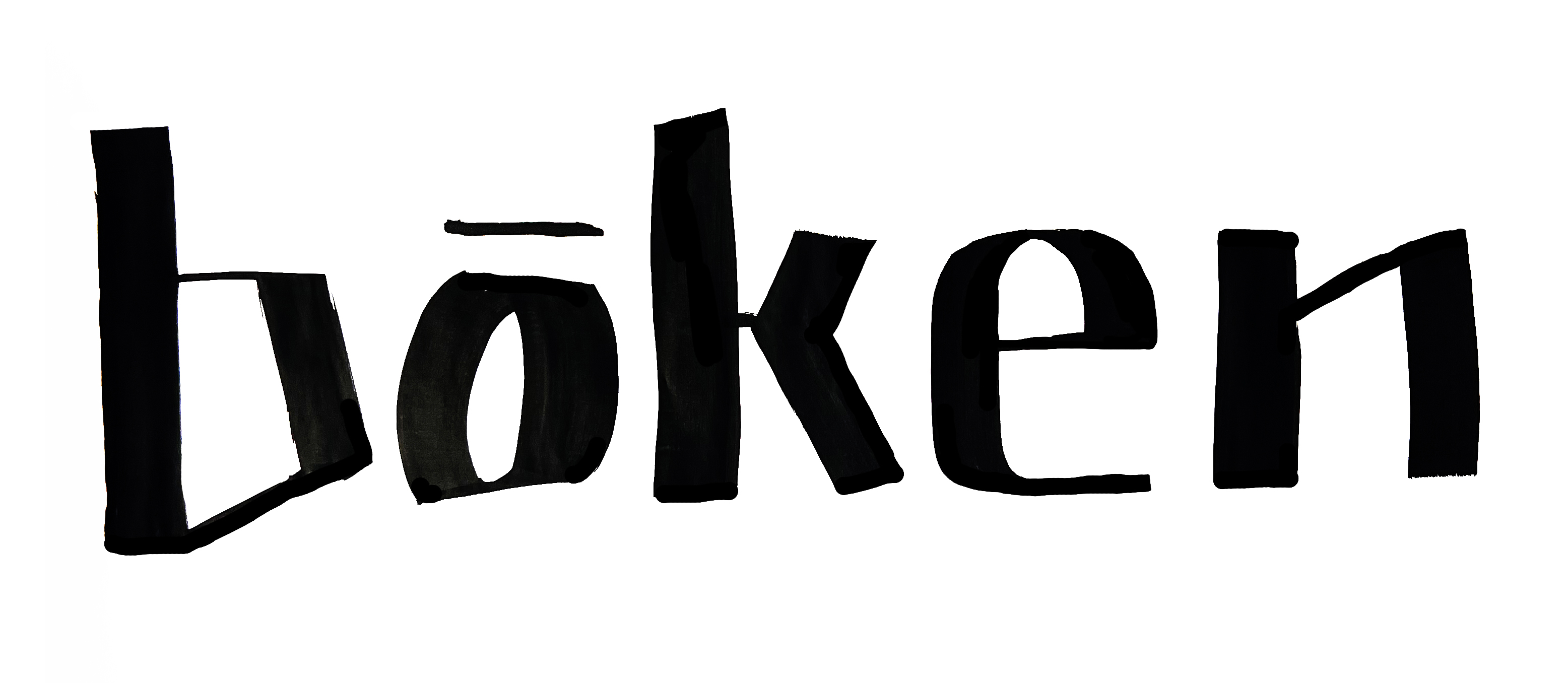
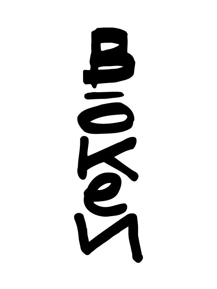
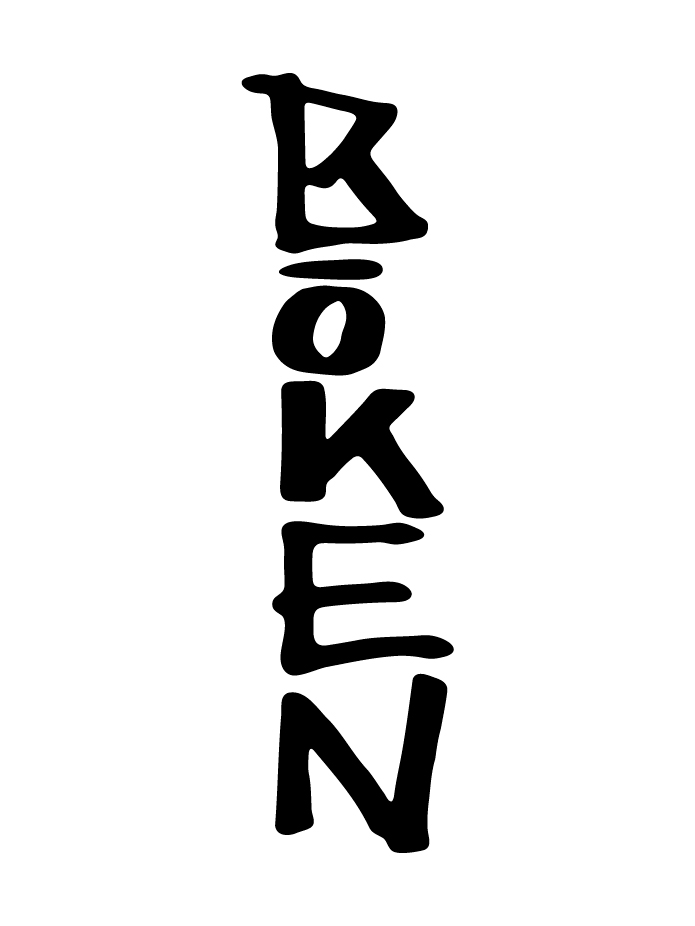
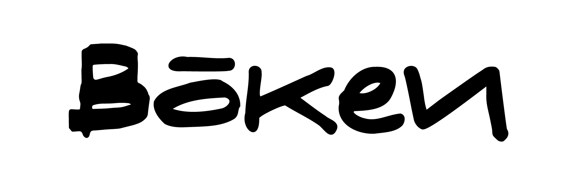
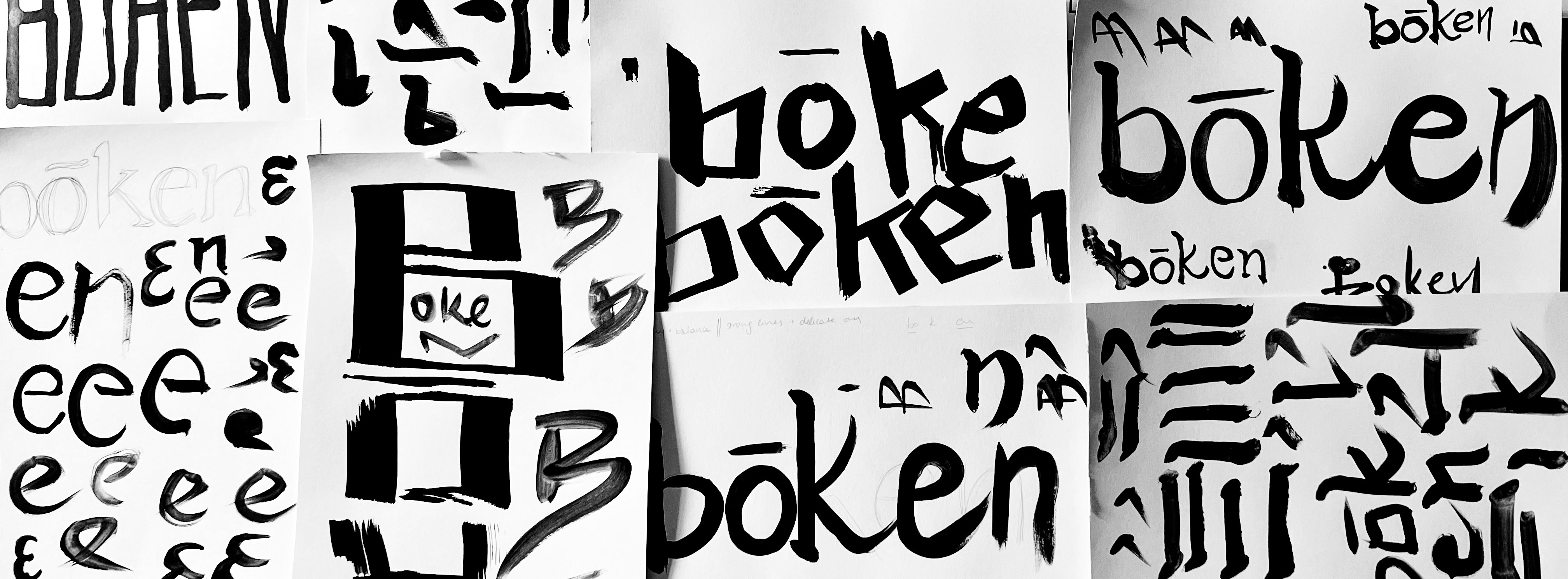
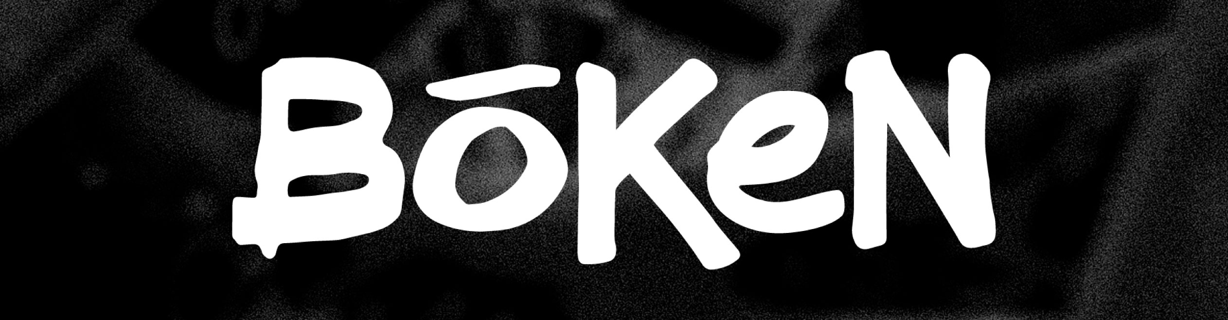
The logo was developed through an extended phase of hands-on experimentation, starting with ink and brush studies to translate qualities of Japanese calligraphy into a Latin wordmark. The focus was on pressure, contrast, tapered endings, and the subtle irregularities that occur when a brush changes speed or direction. Rather than referencing a specific style, the aim was to capture a sense of balance, flow, and continuous movement across the word.
In parallel, more graphic explorations drew from graffiti tagging, testing faster, more angular constructions where the letters compress and lock together into a single gesture. These studies explored sharp directional strokes, exaggerated terminals, and uneven weight distribution to create a compact, forward-leaning form without relying on decorative tropes like drips or outlines.
The final mark sits between these two languages: the elasticity and modulation of brush lettering combined with the density and immediacy of a tag — expressive, but controlled, and built to hold together as a single typographic unit.